Case study

Litex

Legal search engine

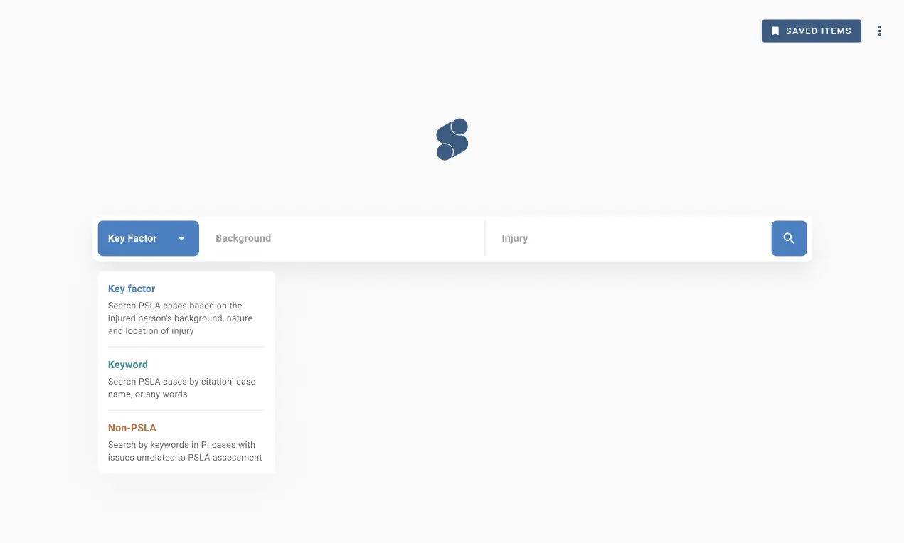
The Litex v3 search bar with a dropdown offering Key factor, Keyword and Non-PSLA search modes
Role
UX designer (freelance)
Duration
3 months
User interviews
10
Key factors
20+
  • Identified the real target users through 10 remote interviews: inexperienced barristers and young solicitors without a proprietary database of past PSLA work
  • Simplified the search flow with clear hierarchies for 20+ key factors
  • Designed Broaden Search and Auto Exclusion — shipped at very low development cost, defusing the fear of over-filtering
  • Component-based mid-fi documentation let two developers start building early; high-fidelity design was finished in a few days
  • Facilitated a Design Studio workshop that converged the team on Litex’s third iteration

Litex is a key factor–based search engine for legal practitioners. Instead of a single keyword box, it finds reference case authorities for PSLA (pain, suffering and loss of amenity) cases through factors such as plaintiff occupation or location of injury. As a freelance UX designer, I spent three months with CEO Chloe Chan and her team from HKU Law School, helping the product find focus and simplifying an overwhelming search interface into a flow of interactive inputs with helpful feedback.
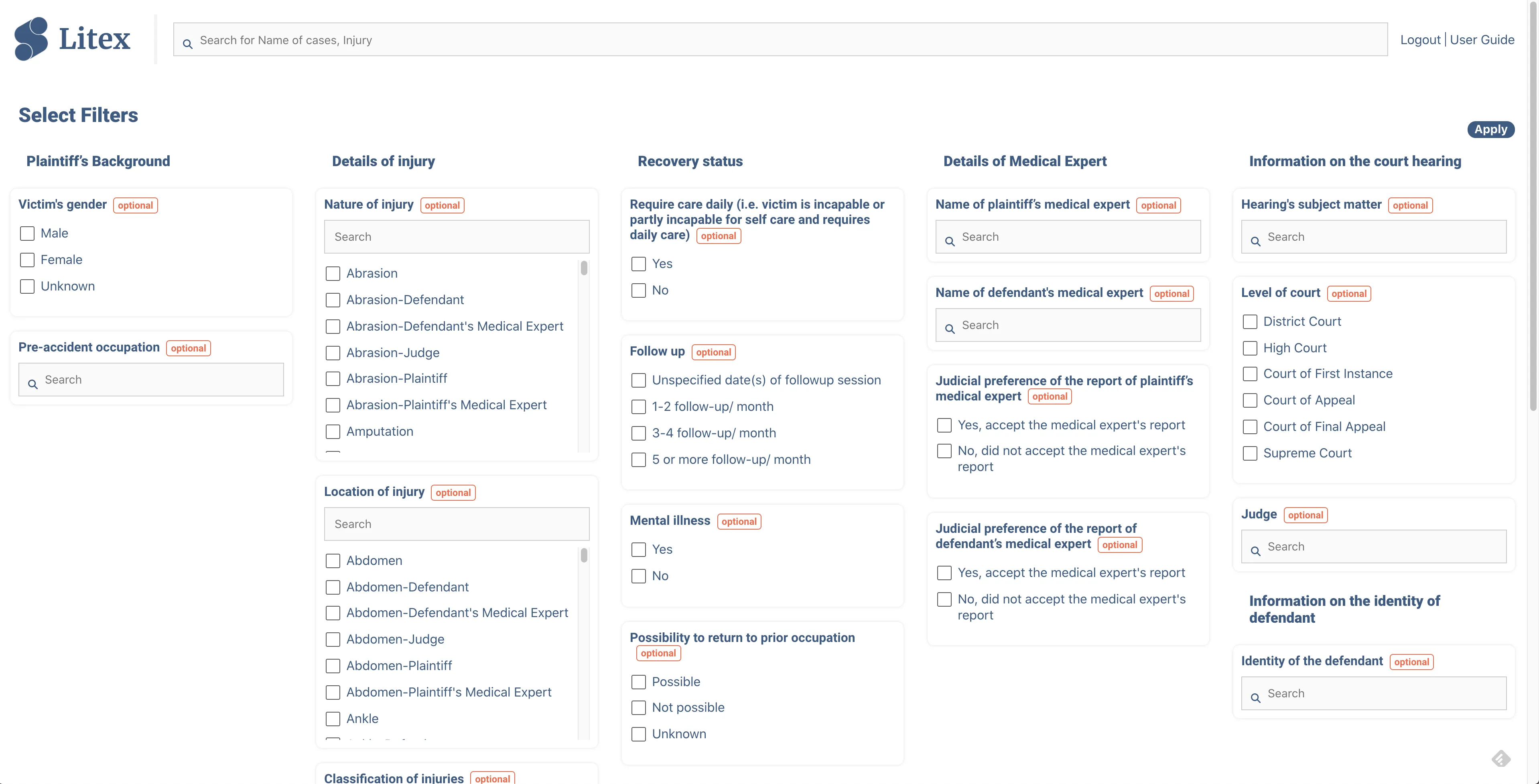
The Litex v2 landing page, with every key factor input presented at once
Before the project: Litex v2 (live) presented all key factors on landing.

What I did

  • Facilitated remote user interviews and analysis, plus stakeholder interviews
  • Strategy planning and a usability audit
  • Internal workshop facilitation
  • Design documentation for components, layouts, logic and interactions (Figma, Whimsical)

Finding the real users

It was easy to assume every lawyer needs case search. We organised 10 remote interviews with barristers and solicitors, mapping legal research workflows down to the distribution of roles and responsibilities inside a firm. The analysis pointed somewhere specific: the target users are not the experienced barristers you see in court, but the inexperienced ones and young solicitors who haven’t yet established a proprietary database of previous PSLA work.

A Design Studio workshop and a User Centred Design Canvas session with the CEO then sorted the solution space — the team came away much less confused about which features mattered, and which sounded cool on an interface but were trivial in the big picture.

Key factor search limits scope by design; that is what saves time skimming through too many results. But it can limit the scope too much: an empty results page looks bad, and even a healthy one leaves users worrying that a not-so-important factor filtered out something useful.

We designed Broaden Search, a button that removes the next potentially unimportant key factor from the current search — and indicates how many results it will add before you click. Behind it sits a key factor hierarchy, ranked with the help of our advisors and interviewees. Broaden Search was achieved at very low development and performance cost; Auto Exclusion went one step further, automatically excluding the lowest-importance factors when a combination is too unique to return any results.

Search results summary bar with the Broaden Search control
Search results summary • Broaden Search

Documentation two developers could build from

Two developers had 1.5 months to build the third iteration. To deliver design ideas at maximum speed, I shared mid-fi documentation in Whimsical that breaks the application into key components, presenting their variations and interactions as flow charts — down to the little things that define a search bar, like how auto-suggestions are ranked, what opens in a new tab, and how overflow text truncates. With mid-fi as the primary spec, developers started very early and liked the elaborate interaction details; high-fidelity design, mostly focused on styling, was finished in just a few days.

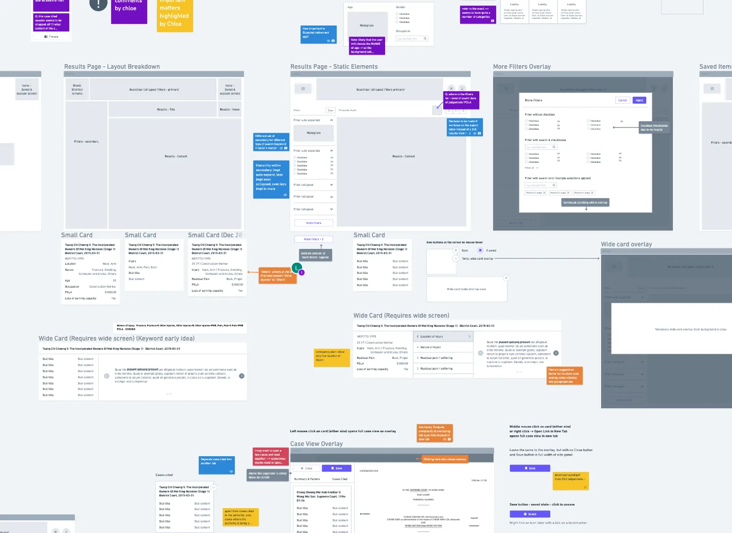
Whimsical flow chart brainstorming Litex layouts and components
Mid-fi v1 • Layouts & components brainstorm

My engagement ended after three months, with reflections handed over for future directions — a community-tagging ecosystem, and backend upgrades like synonym matching that Broaden Search cannot do. Litex shipped as a live beta.

Read the full case study

I worked with Chloe Chan, an entrepreneur from HKU Law School and her team.

The project won multiple championships with its innovative pitch & POCs, and the team felt a need to streamline the experience so that it stands out from existing search tools without being overcomplicated.

I helped Litex find product focus, and simplified an overwhelming search interface into a flow of interactive inputs with helpful feedback.

Key responsibilities

  • User interview (remote, facilitated) & analysis

  • Stakeholder interview

  • Strategy planning

  • Usability audit

  • Internal workshop facilitation

  • Design documentation for components, layouts, logic, interactions (Figma & Whimsical)

Outcomes

  • Strategy: Identified target users & competitive advantages

  • Designed the 3rd iteration of Litex:

    • Search flow simplified with clear hierarchies for 20+ key factors

    • Robust & reliable interaction patterns before, during and after search

Project factsheet

Product nature End-to-end Web App Age Development began in 2019 My role UX designer (Freelance) Project duration 3 months, Dec 2020 - Feb 2021 Size of design team 1 Size of development team 2 (1 frontend, 1 backend) Status Live beta; No updates available after Apr 2021

Under NDA, some details and findings labeled with 🔒️ were skipped or obfuscated on purpose.


Product Backstory

Litex is a key factor-based search engine for legal practitioners to find reference case authorities, specifically PSLA (pain, suffering and loss of amenity) cases. It minimises the manpower required for manual extraction and sifting.

With the integration of AI & NLP technologies as a long-term goal, the product’s database is currently sorted by humans manually tagging case authorities.

The Litex v2 landing page, with every key factor input presented at once

Before project: Litex v2 (live). All key factors presented on landing, e.g. plaintiff occupation, location of injury, mental illnesses, name of medical expert.

Challenging the status quo

Most search engines in the legal space are keyword-based (single search bar, like Google) with algorithmic enhancements behind-the-scenes. Litex’s idea of using key factors aim to make the process more contextual and controllable by the user. The idea was to encourage the selection of values under specific factors most commonly seen in PSLA cases.

However, that’s a lot of inputs

Users could be intimidated by the thought of having to fill in as many key factors as possible for accurate results. Making the search experience easier while keeping the powerful edge of key factors was the project focus.


Chapter 1 • Identifying users

It was easy to assume every lawyer has a need for finding relevant cases as they prepare for client briefings, negotiation sessions or skeleton judgements for court.

Generalising a wide spectrum of users and hoping to cater to all of them is a common pitfall which would make prioritisation work very difficult.

We organised 10 remote interviews with barristers and solicitors, explored legal research workflows down to every detail, the distribution of roles and responsibilities in a firm, and how their minds work in relation to the productivity tools they use.

A research plan document drafted before writing interview questions

One of the research plans before drafting interview questions

Mind maps of primary, secondary and non-personas, with details obfuscated

🔒️ Primary, secondary & non-personas on mind maps

Affinity analysis board for user interview round one, grouped into insight statements

🔒️ Affinity analysis for user interview round 1. Items grouped into insight statements.

Outcome

We clearly identified the target users - they’re not the experienced barristers we see in courts, but the inexperienced ones and young solicitors who haven’t established their proprietary database of previous PSLA work.


Chapter 2 • Participatory design

Problem

No one seemed to have a clear vision of where the product should head next. The team lost a few members recently, and the remaining is finding it difficult to build the technologies they planned. The product has to be simplified, without slowing down go-to-market.

I held a Design Studio workshop the first time I met face-to-face with the whole team. We shared findings from user interviews, and within a few rounds of rapid sketching we diverged and converged on the product’s next iteration.

Scanned sheet of rapid Design Studio sketches

Design Studio sketches. Expand for more.

Second scanned sheet of Design Studio sketches

Third scanned sheet of Design Studio sketches

Fourth scanned sheet of Design Studio sketches

Does it have to be all-in-one, right now?

I questioned whether the product has to cover all grounds, from looking up cases, to making notes, generating summaries, and even exporting them. Dev resources are scarce and we need to sit down and prioritise.

We ran another round of user interview focusing on testing assumptions made during Design Studio ideation, and topics that help us define what is the biggest difference a search tool can make, and what isn’t.

Affinity analysis board for user interview round two, grouped into connected workflows

🔒️ Affinity analysis for user interview round 2. Items grouped into connected workflows.

This findings from this round’s affinity analysis were categorised into:

  • Initiating work: the who & why

  • Workflow: client communication → docs to prepare → looking up cases → processing results → further research into cited cases

  • Work done in parallel to research

  • Docs & personal knowledge base: letter of advice, format & tools, how they organise their folders for future reference

  • Product value: monetisation potential, market needs & the markets that don’t need us

Grounding

I sat with Chloe, the CEO, to work on a User Centred Design Canvas listing out the problems, motives & fears, solutions & competitive advantages. Items under each section were prioritised from most valuable to far into the future or irrelevant.

User Centred Design Canvas listing problems, motives, fears, solutions and competitive advantages

🔒️ User Design Centred Canvas

Outcome

Team was much less confused. We had a better idea how not to overwhelm ourselves with every solution we thought were useful.

During the process of listing out competitive advantages, we naturally acknowledge how some features sounded cool when sketching them on an interface, but are trivial in the big picture.


Chapter 3 • Investigating emotions

Problem • Fear of missing out

We listened to the feedback and frustrations of trial users, outlined the common research workflow and users’ thought at each touchpoint.

The idea of key factor search is to limit the search scope, saving time skimming through too many results one by one.

However, it may limit the scope too much, and it also looks bad when the results page is empty. Even when there is a good number of search results, users might worry that something useful might be filtered out by a not-so-important factor they entered.

Search results summary bar with the Broaden Search control

Search results summary • Broaden Search

We need a way to zoom out, one step at a time. We came up with Broaden Search, a button that removes the next potentially unimportant key factor from current search scope, with an indication of how many results it will add when it’s clicked.

To decide which key factor to suggest for removal, we set up a key factor hierarchy, ranking all of them with the help of our advisors and interviewees. Knowing the importance of key factors against each other also helped make design decisions like the display of filters.

Key factor hierarchy, ranking all factors by importance

Search result filters ordered according to the key factor hierarchy

Left: Key factor hierarchy; Right: Search result filters according to hierarchy

Outcome

Broaden Search was achieved with very low development & performance costs, but a huge improvement to the experience of using key factors search.

We also moved 1 step further by implementing Auto Exclusion to avoid scenarios of having no result due to combinations that are too unique, by automatically excluding the factors starting from lowest importance, saving some frustration and clicks on Broaden Search.


Chapter 4 • Component-based documentation

Problem • Please ship it yesterday

  • The devs had waited enough while we were doing research
  • 2 devs with just 1.5 months to build

In a scaled team, a lot of the specs would’ve been user stories. To deliver design ideas at maximum speed, I created and shared mid-fi with Whimsical. I broke down the application into key components, and presented their variations and interactions in the form of a flow chart.

Whimsical flow chart brainstorming Litex layouts and components, mid-fi v1

Mid-fi v1 (layouts & components brainstorm)

Component-based mid-fi v2 flow chart, with variants as horizontal branches and interactions as vertical branches

🔒️ Mid-fi v2 (component-based) • Each flow chart is a component: variants as horizontal branches, interactions as vertical branches

Simplifying an interface overwhelmed with input means adding meaningful interactions to display & request only the parts needed according to the intended use case scenario. Every interaction defines the experience of a search bar - I emphasised the importance of the little things like:

Flow chart specifying how search auto-suggestions are ranked

How auto suggestions are ranked

Flow chart specifying which result types open in a new tab for clicks, enter and context menus

Open what type of results in a new tab or not: mouse clicks, enter, context menus

Flow chart specifying how overflowing text is truncated

How overflow text are truncated

Flow chart specifying how a combined radio and checkbox list behaves

How a radio+checkbox list is expected to work

Styling purposefully

Being a text-heavy application, there is no margin for elements that further increase cognitive load. The latest versions of Material-based frameworks suggest a consistent choice of theme, like a decision between outline vs shadows, but I mixed them up with a strategy:

  • Alternating neutral colours to communicate layers: Grey → White → Grey → Darker grey

  • Outlines for interactive elements, mostly the ones that help you navigate, search & read

  • Like a sheet of paper, card with shadows always contain a single case authority, and only that. They could appear as interactive search results or summaries of cited cases. Click and you see the full document.

Litex v3 results page with filters and interactive result previews

Litex v3 case authority view with summary and jump-to-factor navigation

Litex v3 (high fidelity) • Left: Results page with filters & interactive previews; Right: Case authority view with summary & jump-to-factor

Outcome

Using mid-fi as primary documentation with high-fi that mostly focused on styling, developers were able to start very early, and they loved the elaborate details regarding interactive elements.

Having elements laid out and planned, it was easy to properly implement Figma components & variants, and high-fi design was finished in just a few days.


Chapter 5 • Forward

My time was up as a freelance consultant. Reflections & thoughts for potential future directions:

Ecosystem approach

Before NLP & AI technologies are available for automated tagging of case authorities, the product relies on human taggers, and the business pays some of them to do it: They read case authorities, highlight relevant words, assign relevant key factors, and sometimes enter a value for standardised parameters.

A case authority document with tagged contents underlined

Tagged contents underlined

Reading case authorities is exactly what junior solicitors & barristers are doing anyway - the product can turn it into an ecosystem where community contribution of tags & corrections can, for example, earn rewards for using the platform at a reduced cost.

Designing the backend

Some parts of the key factor database were obstacles when simplifying information display or input interactions. There were certainly potential for us to gather feedback and clean up or upgrade the backend.

To start, we could work on matching the synonyms of occupation & injuries. For example, when searching for forearm injuries, the results could include any parts of the arm with a similar severity. This is something Broaden Search cannot do, and further maximises the advantages of key factors compared to keyword-based search.

🙌

Finally, I cannot appreciate Chloe enough for her trust in doing research early & often. Lawyers’ time is expensive, but she went out of her way to invite a panel of interviewees of various levels of experience to talk to a guy who seemingly has no clue. Thank you.


Published Feb 2023

Suggested questions

Answers are AI-generated from my project notes and may contain mistakes.